Den Sidste Flaske
A product page that earns the sale
Redesigning an online wine shop’s product page around proof, so buyers trust a bottle before they ever taste it.
- Role
- Timeline
- Tools
The problem
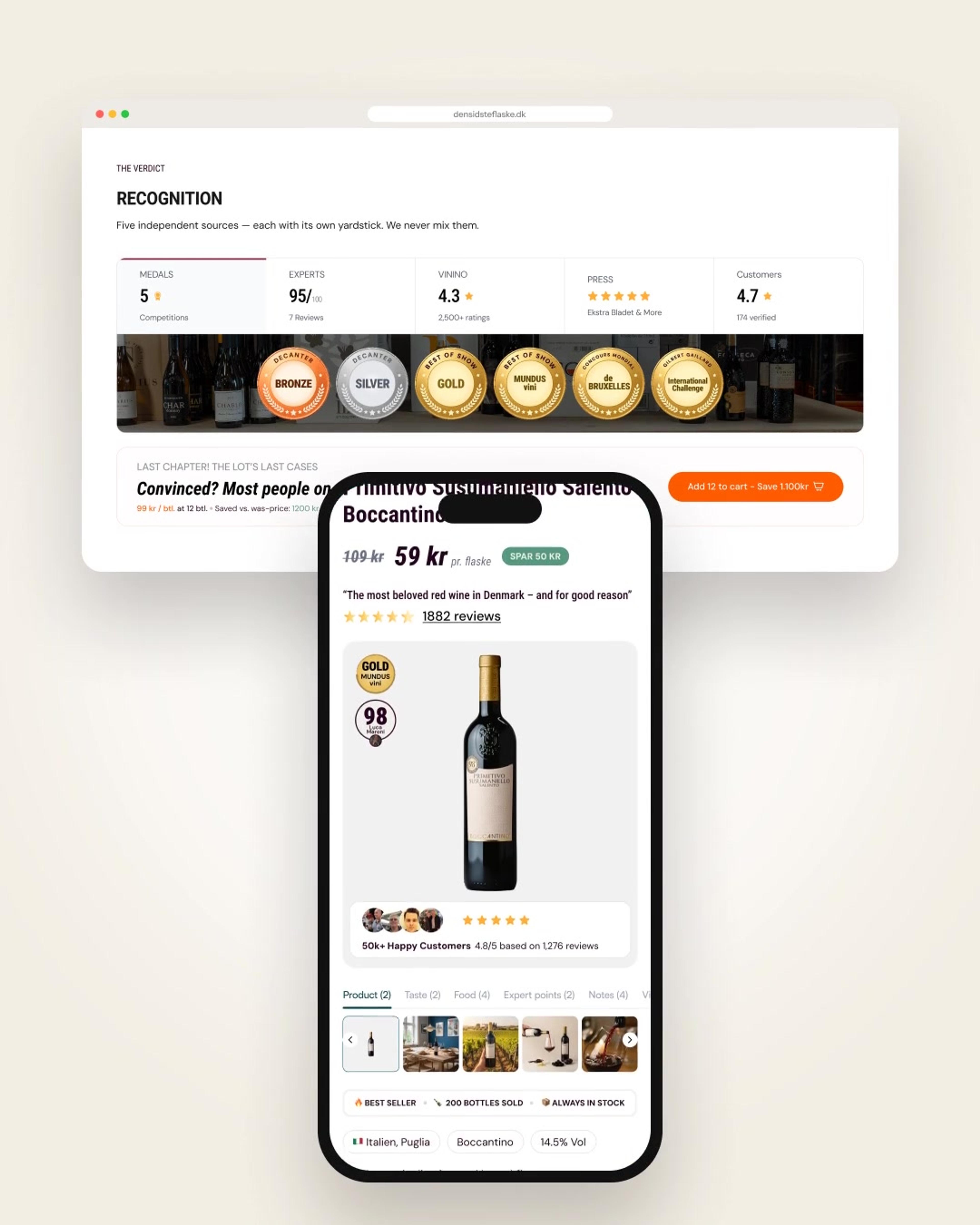
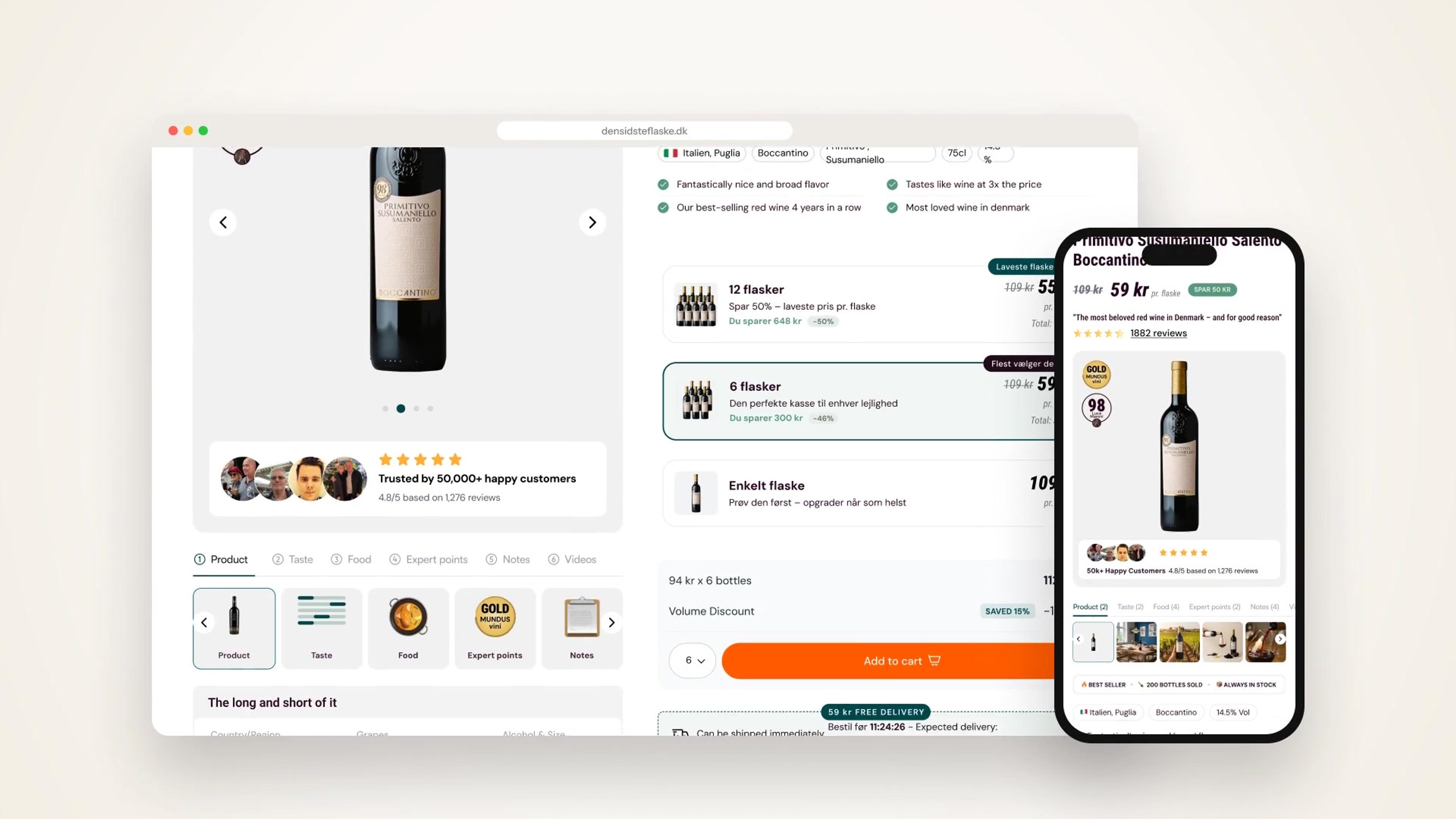
Online, the product page does the sommelier’s job. The live page led with price and a buy button, while the proof that actually convinces people (medals, critic scores, Vivino ratings, press and customer reviews) was scattered or blended into a single number.
On mobile, where most visits land, the page ran past 12,000 pixels. And after checkout, customers asking about delivery or pre-sell stock had nowhere obvious to go.
What I decided
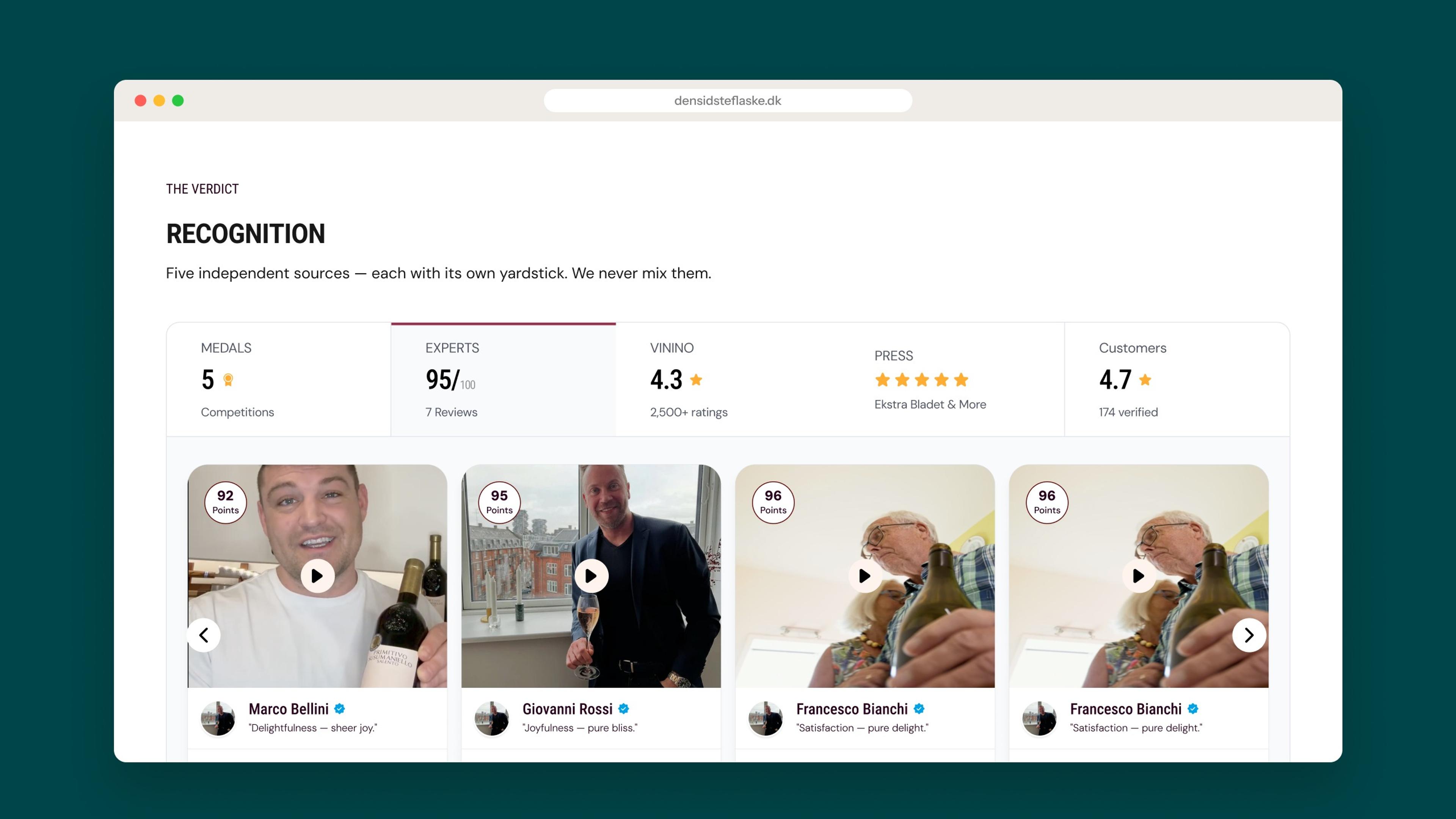
Proof first, and never blended. A new Recognition section shows five independent sources side by side, each on its own yardstick: medals, experts, Vivino, press and customers.
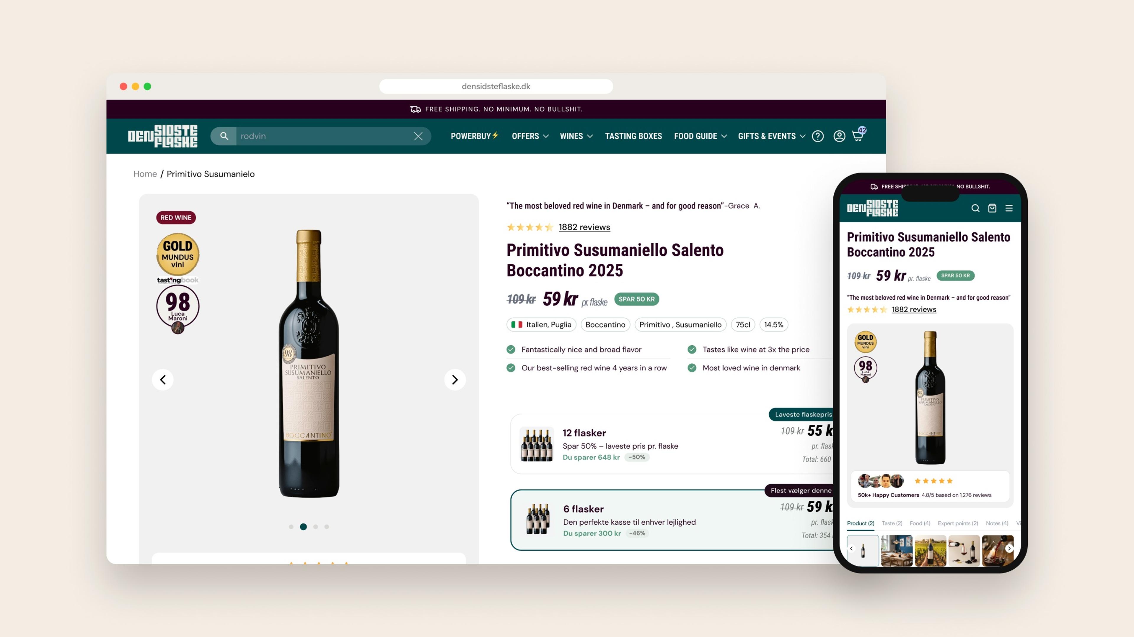
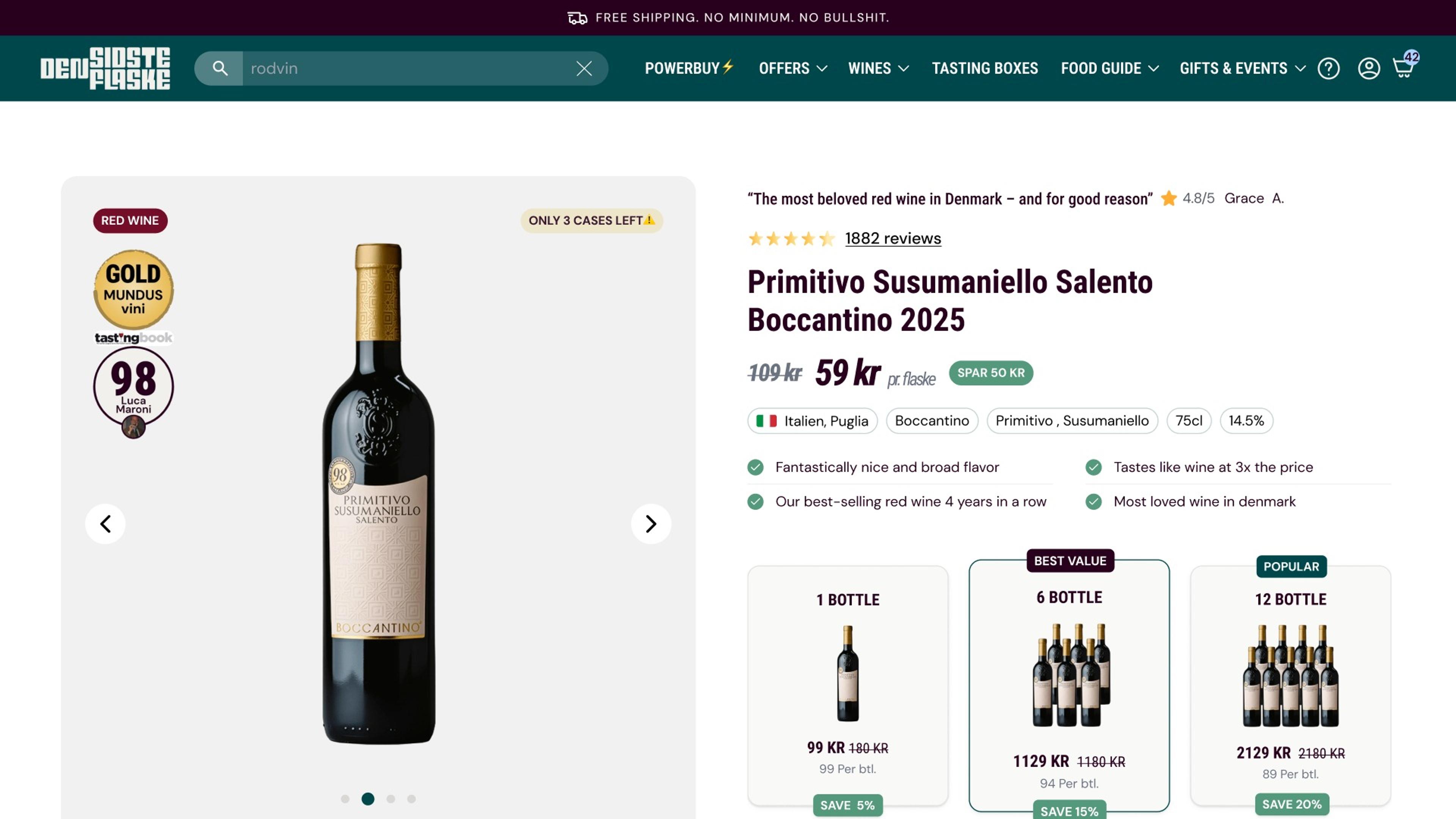
Volume pricing moves to the moment of decision, so the saving on six or twelve bottles is visible next to the button. I explored five hero variants on desktop and mobile to decide what earns a place above the fold.
Then I followed the customer past checkout: an order tracking page that answers “Where’s my wine?” and an FAQ I wrote to be honest about delivery times and pre-sell, flagging every promise operations had to confirm.
The build
Hero iterations, the Recognition tabs, volume pricing selectors, full mobile product pages, a second template version ready to roll across the catalogue, plus the order tracking journey and FAQ component.
The full case study
The full case study includes all five hero explorations, the complete desktop and mobile templates, and the honest FAQ written with operations.
Request the full case studyResults
5
Independent proof sources, shown side by side
5
Hero variants explored on desktop and mobile
2
Template versions ready for the whole catalogue
What’s next
A/B test the proof-first hero against the live page and roll the winning template across the catalogue.